Burnham Dramaturgy.
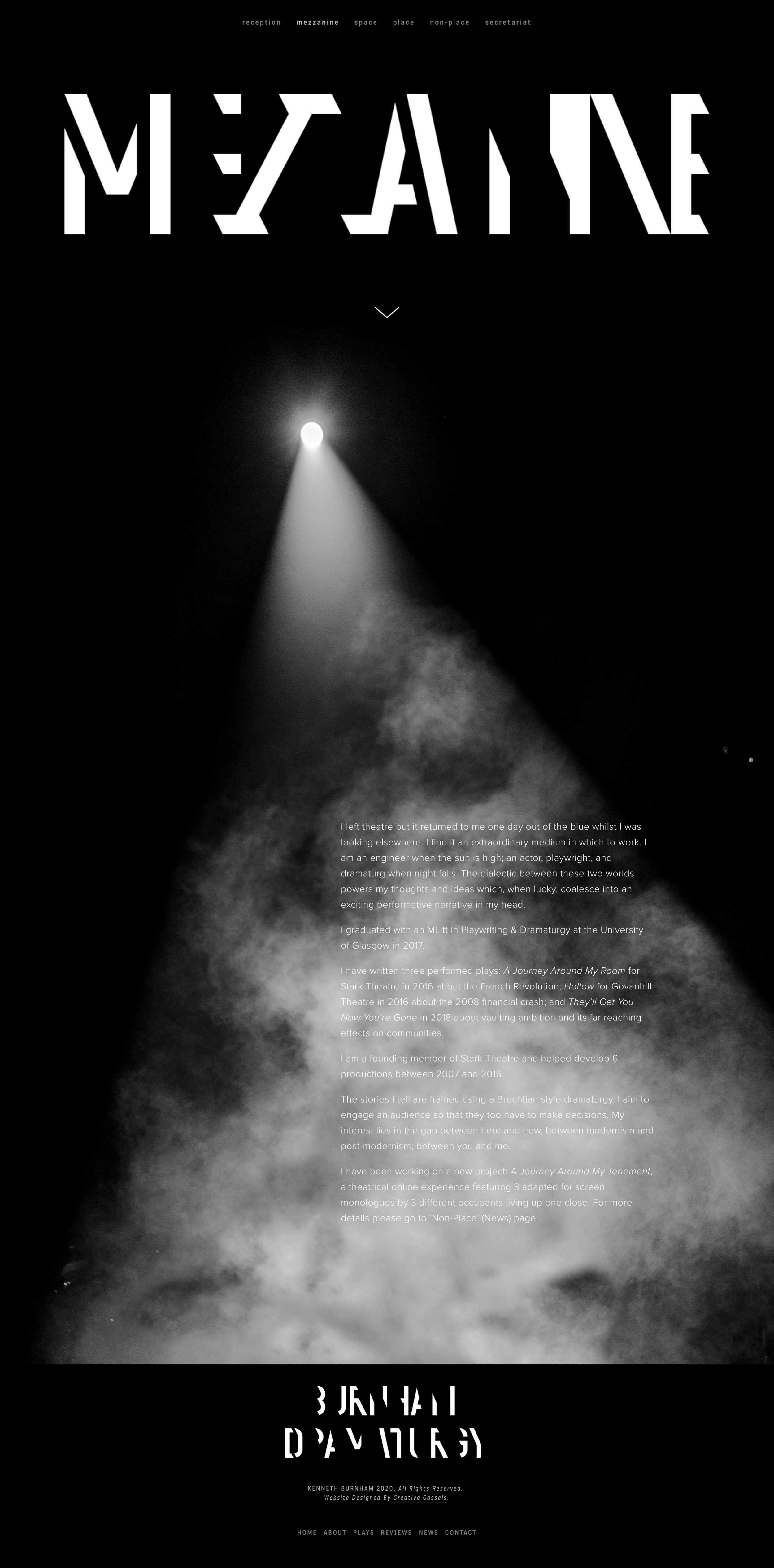
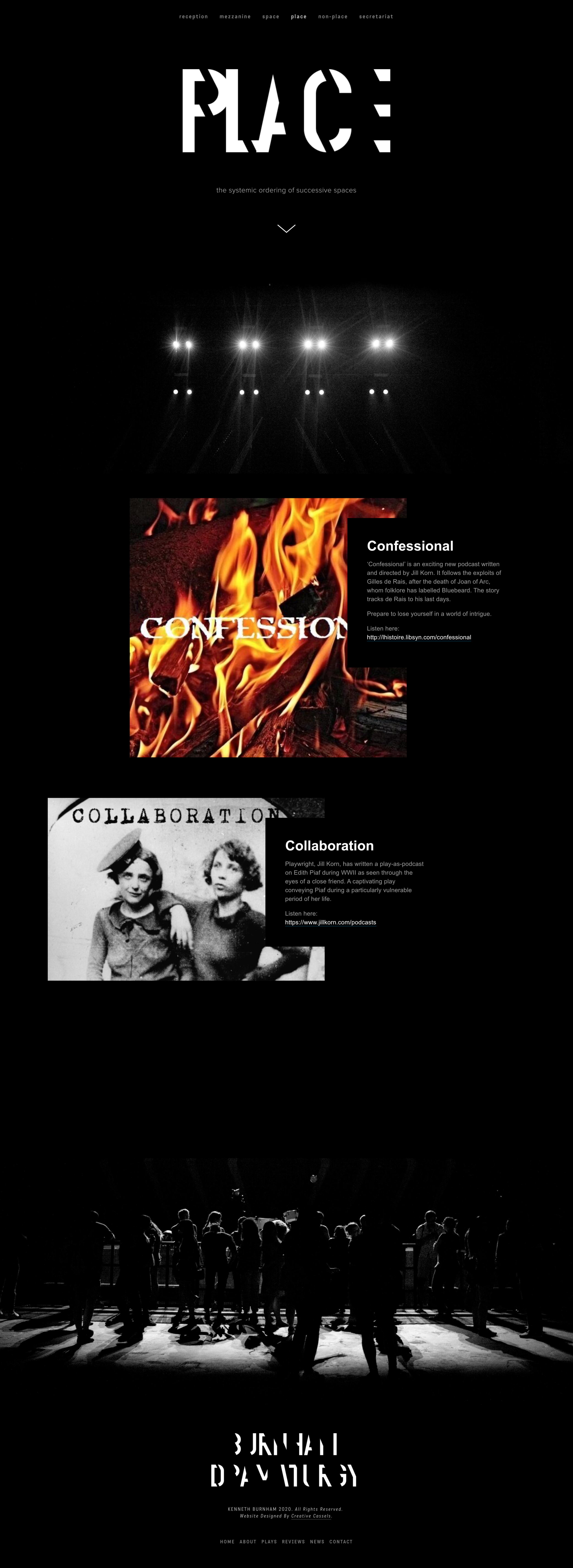
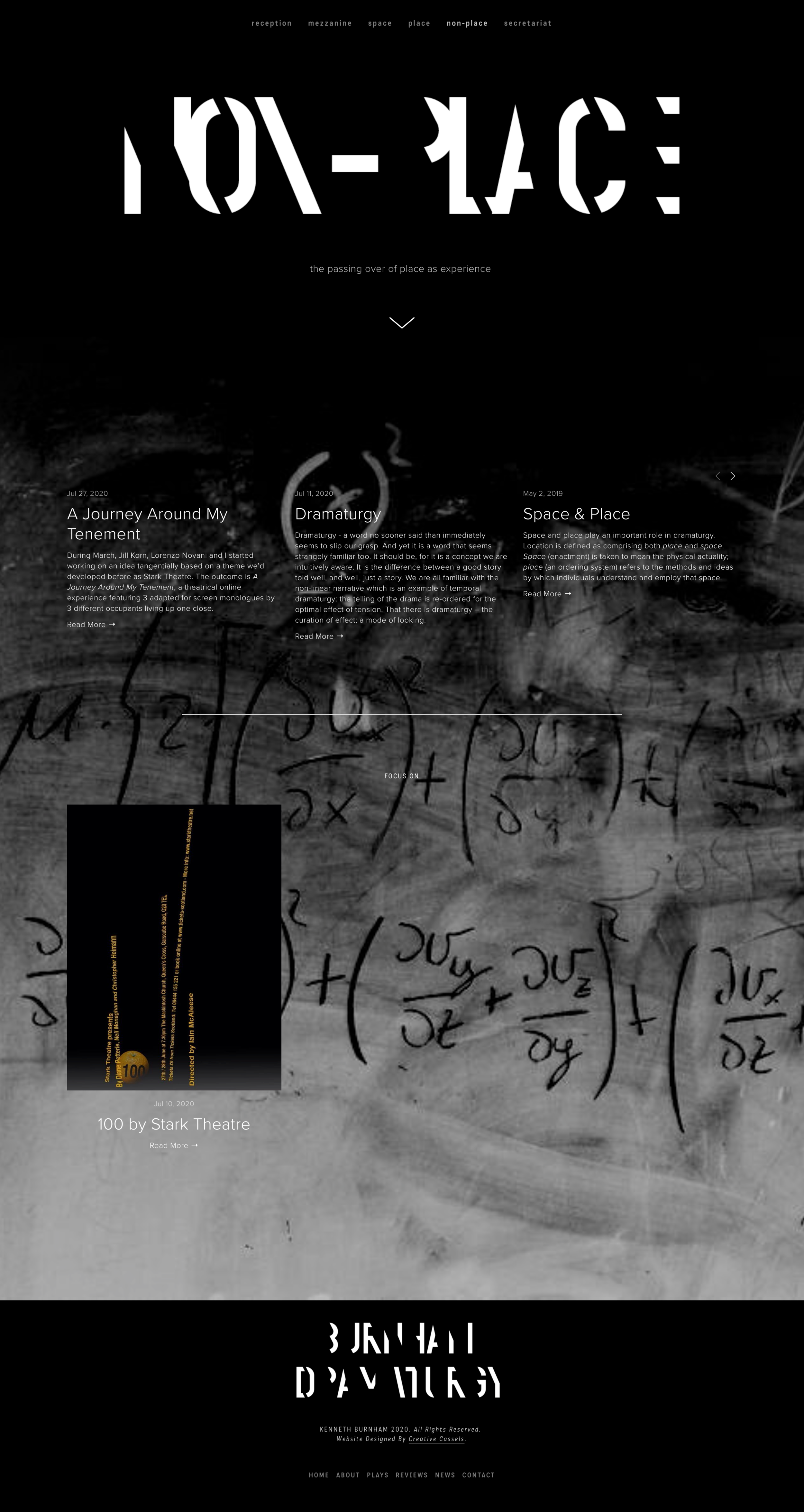
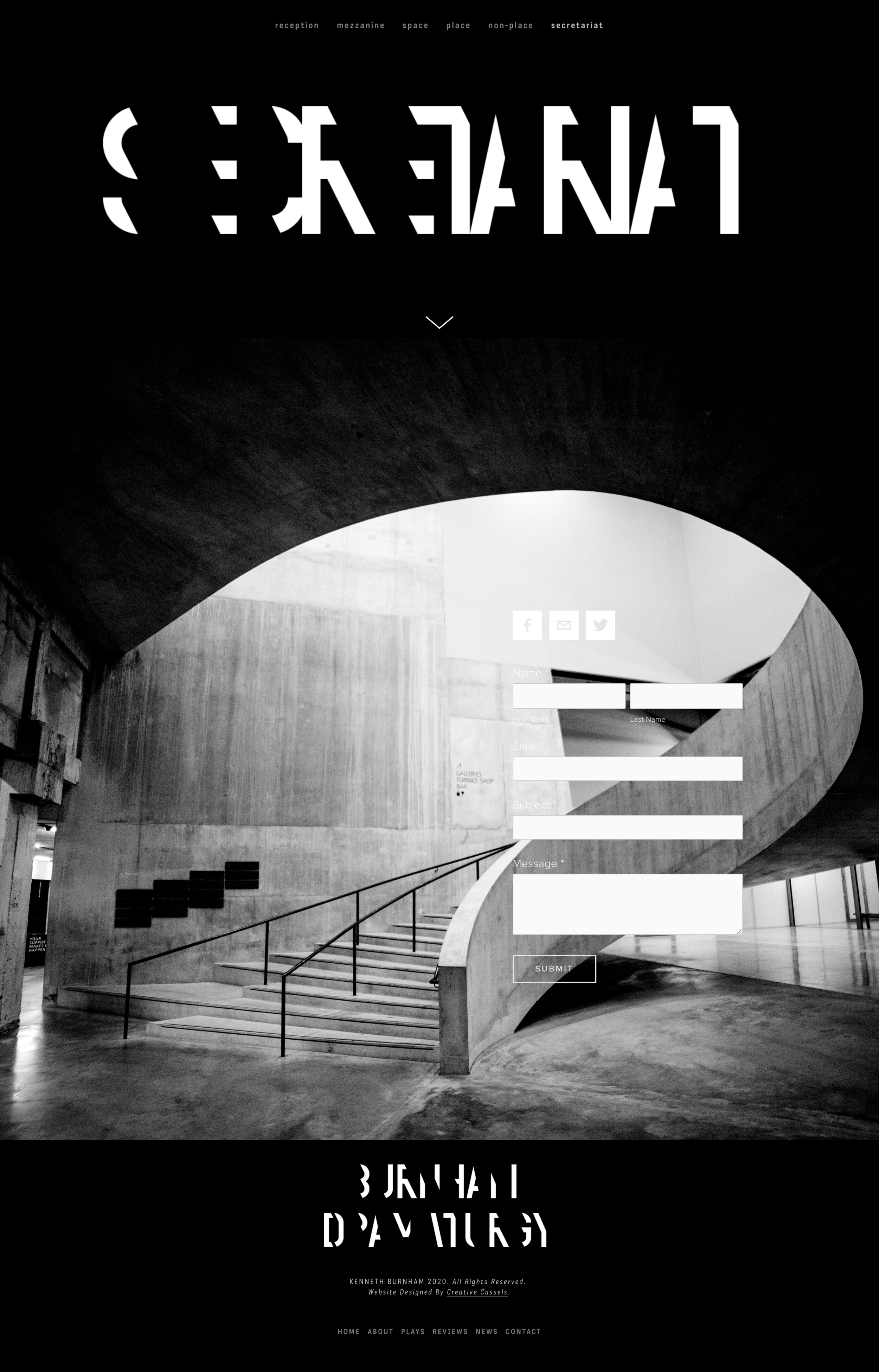
Kenny is an engineer by day, dramaturg by night. He has been writing more and more plays and was after a website of his own, where he could collate his portfolio, upload his new pieces, and ultimately inspire himself to keep being creative. After seeing Jill’s website Kenny approached me to create a website and logo for him, taking into account his different style of dramaturgy and playwriting.
It was a wonderful opportunity to find out more about the theatre, and a fantastic collaboration between two creatives. Kenny’s engineering background inspires his love of brutalist and modernist architecture, cutting edges and dark stark spaces. We had an opportunity here to combine these different styles that provided him with a place to express his dark dramaturg side.
It was an absolute pleasure to get to the essence of what Kenny was looking for and delighted that he was happy with the result. It was what he had envisaged but hadn’t been able to bring to life himself, and I very much enjoyed teasing that out, and producing something that he is now proud of, that matches his brief perfectly.
Brief
The brief was for a website that was ‘modernist in spirit: clean lines, delineated, a machine for browsing.’ To be slightly unsettling or unexpected to the visitor.
Marketing is usually used to invite people in, so the brief was a challenge; to keep simple, while ‘confusing’ the visitor to the site. I wanted to ensure it was still easily navigable despite the blunt juxtaposition required.
The branding was to take inspiration from modernist architecture and BauHaus inspired graphics to create a website that was brutalist, and slightly discombobulating.
I created the name, found the correct font and created the logo, content and imagery behind the website - an enjoyable process and delivery.


