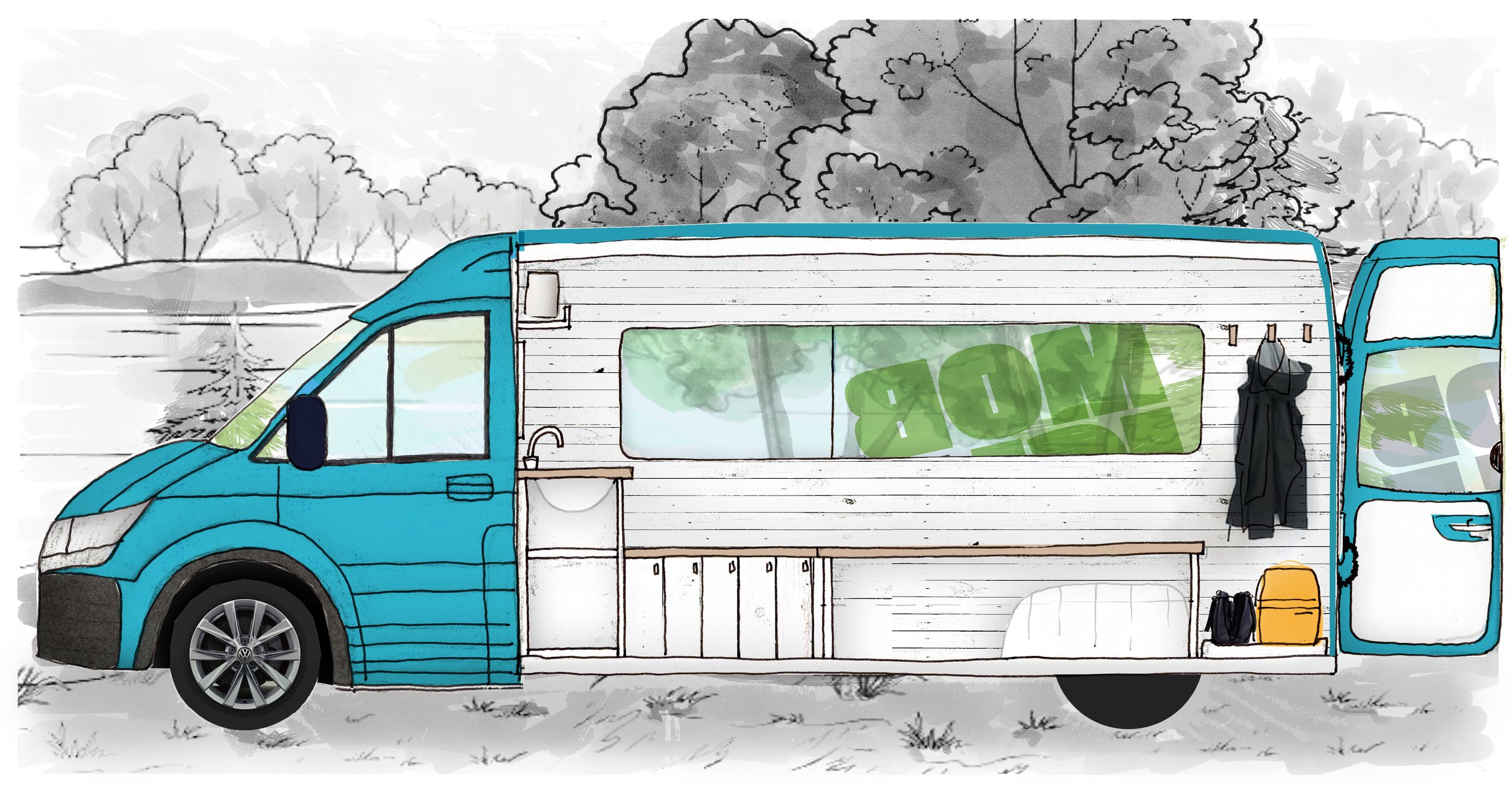
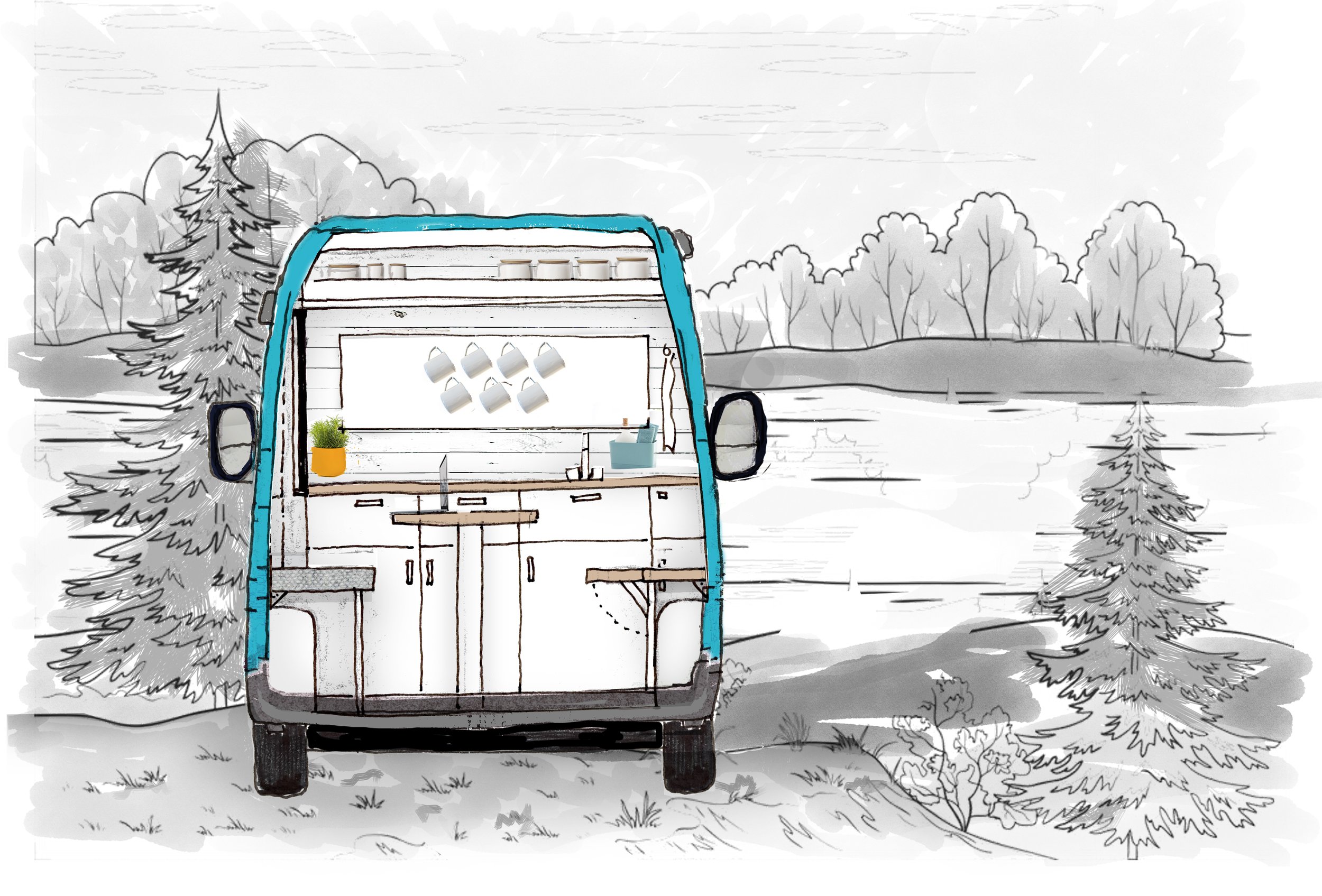
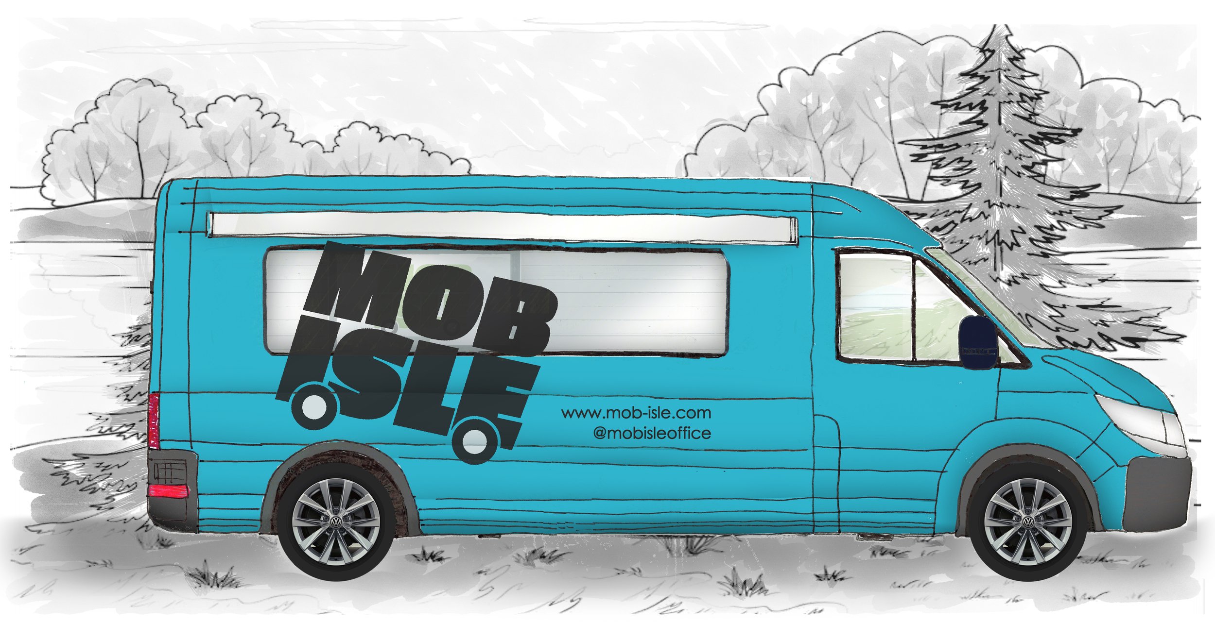
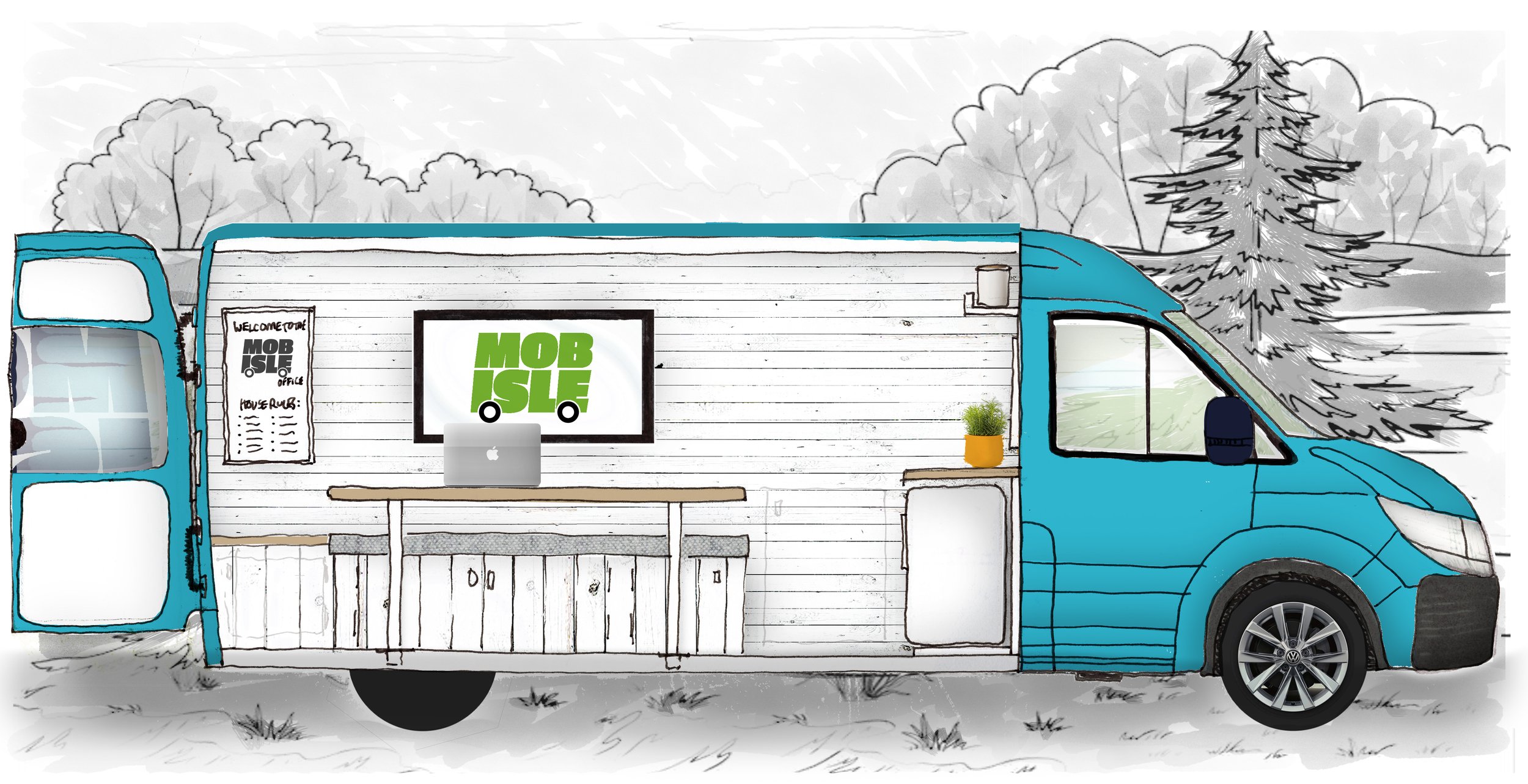
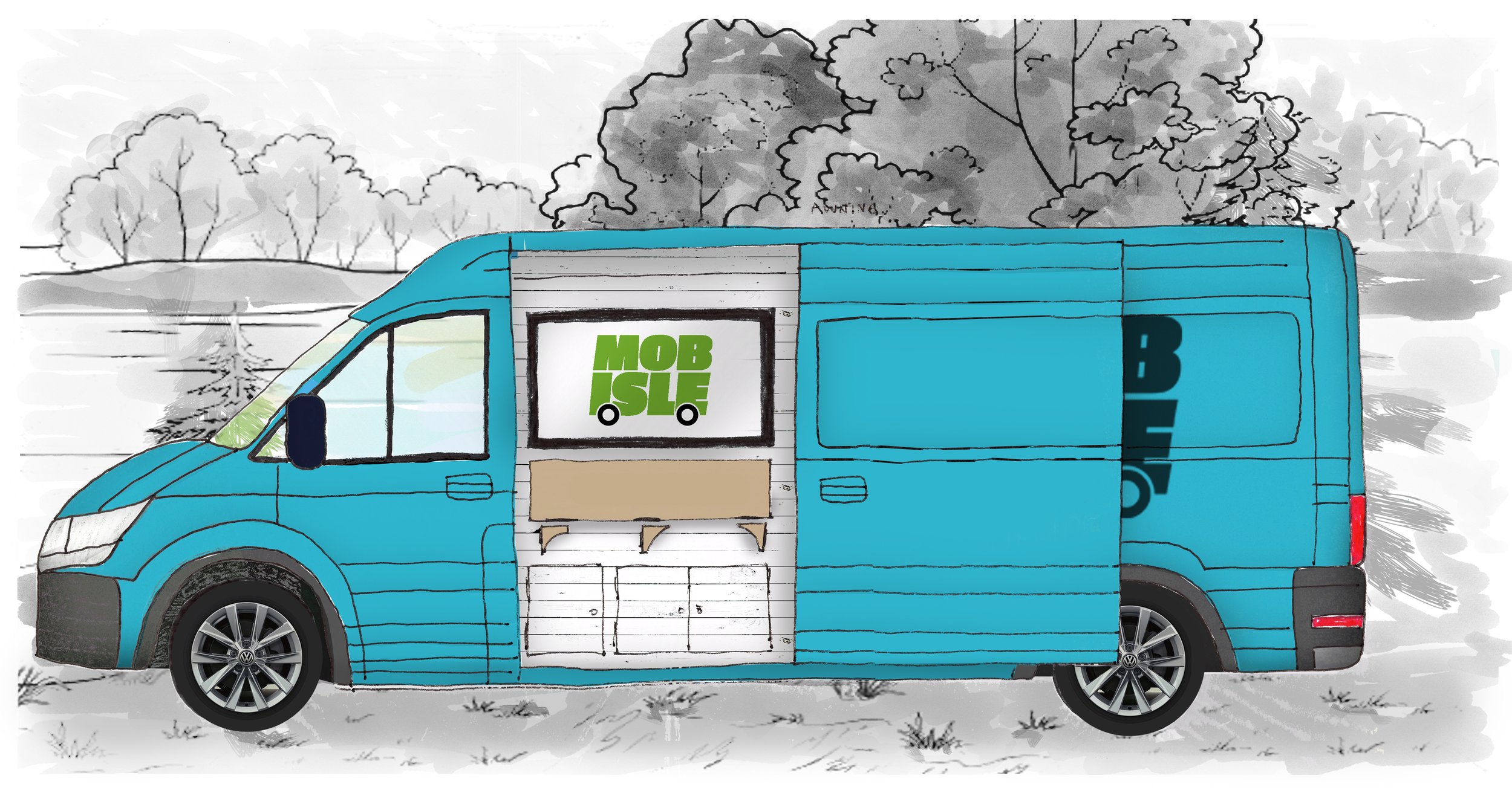
Mobisle Office.
A bit of a different approach. This project was an idea I had that I wanted to explore in more detail teaming up with some respected peers to explore what it could look like as a business. I managed to get some funding from the Paul Hamlyn Foundation to explore the idea in greater detail, leading to a full branding strategy, extensive research and concept design. Unfortunately Covid-19 Pandemic interrupted the process but we managed to round up the exploration and provide a detailed report to the funders.
We wanted to pilot a mobile office space that would service the western islands of scotland, and is both available to third sector organisations and also commercially available to rent to sustain itself. We planned to design and build such a vehicle, brand it, and make it available to certain organisations over a fixed period of time to test the idea, and see if it is commercially viable and sustainable. The funding afforded us to research whether there was a need for this type of service, design it and look into the business strategy.
Brief
We plumped for the name Mobisle, a nice play on words and engaged one of our favourite graphic designers - Scott from Gallusness (link below) to design our logo. We got fantastic options from Scott and ultimately brilliant logo, colour palette and branding options, exactly what we were after.
It was so nice to work with external designers and researchers. It would have been a lot of work for one person, and I love to collaborate so this was an ideal opportunity. We had some excellent mechanical and electrical designers on board as well, but unfortunately we never made it as far as costing the vehicle.
Perhaps a project for the future - we think Covid-19 might have resulted in an even bigger need for this kind of service.
Mobisle Office Design
Logo & Branding
We worked with Scott at Gallusness to come up with this logo - he had some amazing options, and it was difficult to narrow it down. Had to go with what was right for the brand not necessarily what we liked the best. It was so nice being the client for a change. I really enjoyed it. I hope I was’t a nightmare client though! Haha.
I wanted punchy, bold, and scottish as a graphic - and I knew Gallusness was my place to go.
